Selfie.

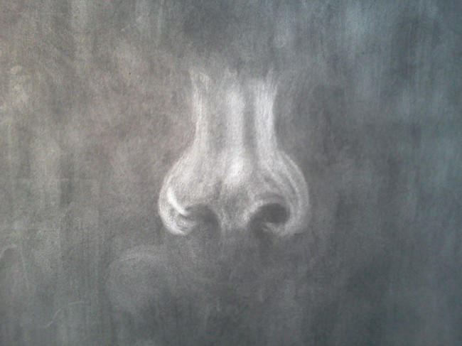
This has got to be my most interesting final that I’ve ever done, in a good way. I actually surprised myself by my end results of the self-portrait. When we first started this project, I was pretty intimidated by our supplies; how was an image supposed to surface from a blackened piece of paper by a tiny eraser? And furthermore, how could I create dimension without shading? The whole class started with the lightest point on their faces; the center of the nose. I drew about five different noses until I was satisfied. Our faces are more detailed than we think; full of crevices and creases all affected by the lamp that shone. 

Image


I also had trouble with getting the right hue of lightness for my nose ring, since it is lighter than the center of my actual nose. Trying to create the nostrils was also difficult because I was doing too much ‘symbolism’. My nostrils are far from perfectly round, but that’s what my brain symbolized them as. Next I worked on my mouth. THE HARDEST PART! Mouths also are very detailed, yet my brain wanted to symbolize it. My mouth doesn’t have a very distinctive cupid’s bow, which helps develop the shape of the top lip…So I literally had to stare at my mouth for a while to get the shape right. Like I stated before, I don’t have a distinctive cupid’s bow so those areas were hard to shade and create contrast between the lightness of my lips and the skin around them. Image

I ended up changing it when I completed the rest of my face . 🙂 Next were my cheeks and chin. Naturally I have very highlighted cheeks and a distinctive chin shape. The chin was very easy to create however my cheeks gave me a bit of trouble. I wanted to created dimension and contrast from the rest of my face so that my cheeks would stand out; also the lamp shone on the, and created more light. Image

Next were the eyes and eyebrows which were very difficult. I have a very defined crease in my eye, but I found it hard to see in the mirror with my heavy eyeliner. The problem with symbolism comes back to haunt me as well. We all think eyes are perfect little ovals with equally as round irises in the middle. Wrong! I went through a ton of measuring with my magic string to get the correct dimensions of where my eyebrows were in comparison to my eyes. Image

And finally! I finished. I am very happy with my results and never knew that I could do so well at my beginning level. As you can see, I lightened the area above my lips because it stood out too much before. I also completed my eyes, which took a while because I wanted them to be around the same size. I wish I could’ve lightened up my eyebrows a little more, but I found that everything looks different in person. 


I loved this final project! I think that my artistic skills really developed over the semester and I hope to continue with more art classes to further improve my skills. 
Super Animal: Joeys for Jane

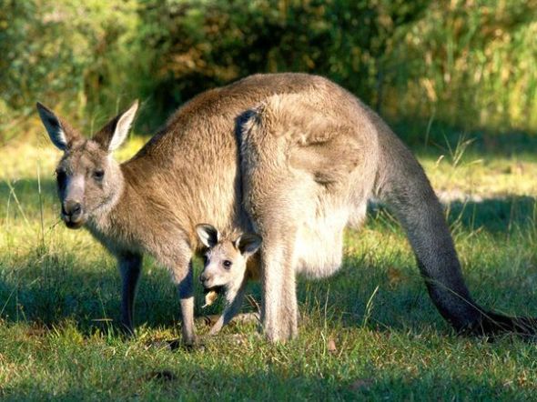
I named my super animal “Joeys for Jane“. I chose the social ill of domestic violence against women which hits close to home. My grandmother was a victim of domestic abuse in her first marriage, and is still mentally scarred from the experience. I looked up animals that are very powerful, yet extremely maternal and protective of their offspring.

I came across a kangaroo. Random I know, but fitting. My Kangaroo’s superpower is to kick the abuser’s ass and carry the victim in it’s mentally and physically pouch. I did research on the Kangaroo, and found that it can stop the development of it’s offspring in case there is a lack of food or water. Kangaroos are also extremely social, which is a good environment for victims of domestic violence to be in. 

I used a milk bottle for the body, a light bulb for the head, sticks for the legs, and added human hands to simulate the hug of a mother. I also hand knitted the pouch, to show how comforting it can be to get healed 

Links 


Image

Peer Review: Ashley Cloud

Ashley’s thumbnails caught my eye the moment we mounted our final projects on the board for  review. Her words were ‘cautious’ and ‘reckless’, and she really did an amazing job at choosing her photographs to correspond with her thumbnails. For ‘cautious’ she took a picture of a lamp, which to me resembled the moon or orb peeking into the frame of the camera very cautiously. For ‘reckless’ she photographed broken glass. To me, the broken glass represented maybe a car accident which could be caused by recklessness or a mirror that someone recklessly broke with no remorse. 

I really applaud Ashley, because I know how hard it is to juxtapose a photograph with a thumbnail that you’ve already created. It’s like your eyes see things differently; anything could appear reckless or cautious, but it’s up to the artist to decide which photographs will accurately compliment the thumbnails. Image


Calm vs. Enraged

Calm vs. Enraged

When this assignment was initially given, I’ll admit that I was very confused. I understood the concept of choosing abstract images to depict my words (calm and enraged) but I didn’t know where to start. I reviewed the powerpoints that our class viewed at the beginning of this assignment to get a more clear approach.
My biggest fear was choosing two symbols that wouldn’t make sense to the audience. A couple of other classmates had the same issue, then Professor Ruby explained that we could counter-balance the symbols and photographs to portray a connection between the two.
I took that advice, and took two pictures that I thought would show a connection more clearly. I had more trouble with calm, because I didn’t want to seem too obvious or cliche. Eventually, I found a happy medium and hopefully the audience can decipher what my original words were by the pictures.

Calm vs. Enraged

Calm vs. Enraged

Let me start by saying that this project is definitely more challenging than I initially assumed. I picked out two relatively easy words to portray; enraged and calm. Now, the hard part was conveying those emotions into thumbnails without using symbolic shapes….meaning no obvious symbols like hearts or smiley faces. So, I took a more open-minded approach to the assignment. I found that drawing my thumbnails for calm were much more easier than enraged. To make things more clear, we came up with sentences that described the principles we want to express. For calm, I wrote “a sense of serenity, stillness, and flow. For enraged, I wrote “full of anger, hectic energy”. Though these sentences aren’t complex, the exercise helped me further develop ideas of the adjectives that I picked.

Blind Contour Drawing

Blind Contour Drawing

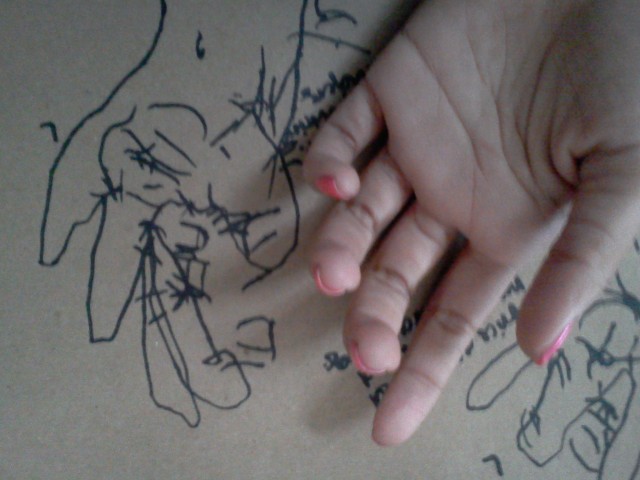
During class, Professor Ruby explained a technique used by many artists to warm up their senses through blindly drawing an object, with out the pen leaving the paper called “blind contour”. The task seemed a bit odd initially because I already expected a messy outcome. After blindly drawing my left hand, I was surprised at the results. It seemed like staring at my hand heightened my ability to see every single detail that I would’ve normally missed. I observed every line, dent, and wrinkle in my hand and tried my best to portray it onto the paper. They say when one of our senses are lost, others are more sensitive. I was very aware of the music that was playing (paying careful attention to the lyrics) and the texture of the paper I was drawing on. I feel like the exercise does a great job at letting go and being free. I didn’t mind all of the messiness that eventually formed into my hand.

An Interesting Combination.

An Interesting Combination.

Before attending the artist talk with Jiha Moon, I was a bit weary. When I initially looked at her work in our art studio and then did my own research, I found that her pieces were very busy..but surprisingly in a good way. I feel as though no other artist could incorporate hello kitty with scary Japanese dogs and twitter birds with out seeming a bit off. But she does, and it’s like nothing I’ve ever seen before. Not only is her work original; it is a reflection of herself. While listening to her speak, she seemed very child-like and free spirited which I enjoyed. You can definitely spot her pieces in a crowded gallery and be confident that Jiha Moon created it. I’m glad that I attended the artist talk and I look forward to attending others in the future. We were able to get a glimpse into her creative process, and how she likes to collect really adorable trinkets to include through out her work 🙂

My Valentine.

My Valentine.

My valentine was dedicated to anyone who’s ever been sucked into the black hole we call love. When I first started, I wanted to draw both sides of the girl’s face; but changed my mind when I wanted the illusion of wind blowing it away. I want to add more detail in the hair, with more swirls and shapes to intensify the look. I wanted the piece to be simple yet intricate at the same time. Overall, I enjoyed this assignment, I wish I had more time to work on it so that I could dig more into the meaning of love. If I was given an unlimited budget to use on this project, I would have definitely used a softer chalk to make the edges less harsh, and I would want some type of material to bring the hair to life.

Woah.

Woah.

So, I have an obsession with Marilyn Monroe…who doesn’t? To me, this picture is the epitome of love versus darkness. This was definitely inspiration for my valentine’s piece. Also I made references to Harvey Dent; aka “Two-Face” from The Batman series. The starting process is very difficult. Facial symmetry is a pain in the ass. But, I’m inspired! Wish me luck.

The Break-down.

The Break-down.

So…as you all can see, I didn’t put much effort into my first attempt of the chair drawing (maybe none). However, the more I worked and got comfortable with the chair..the more intrigued I became. Personally, I feel as though I could have worked a bit more hard on the angles. My main problem was the fourth leg..as you can see, there isn’t one! I didn’t really know how to creep that sliver of leg in there. Also, my chair seat seems a bit raised and the angle is too harsh. My chair appears a little flat… with no personality. But overall, I enjoyed the exercise. I’ll definitely put more effort into the next project. *Girls Scout Honor* 😉